Regenerating our corner of the world with our innovation practice, profits, and passion.
ECOGREEN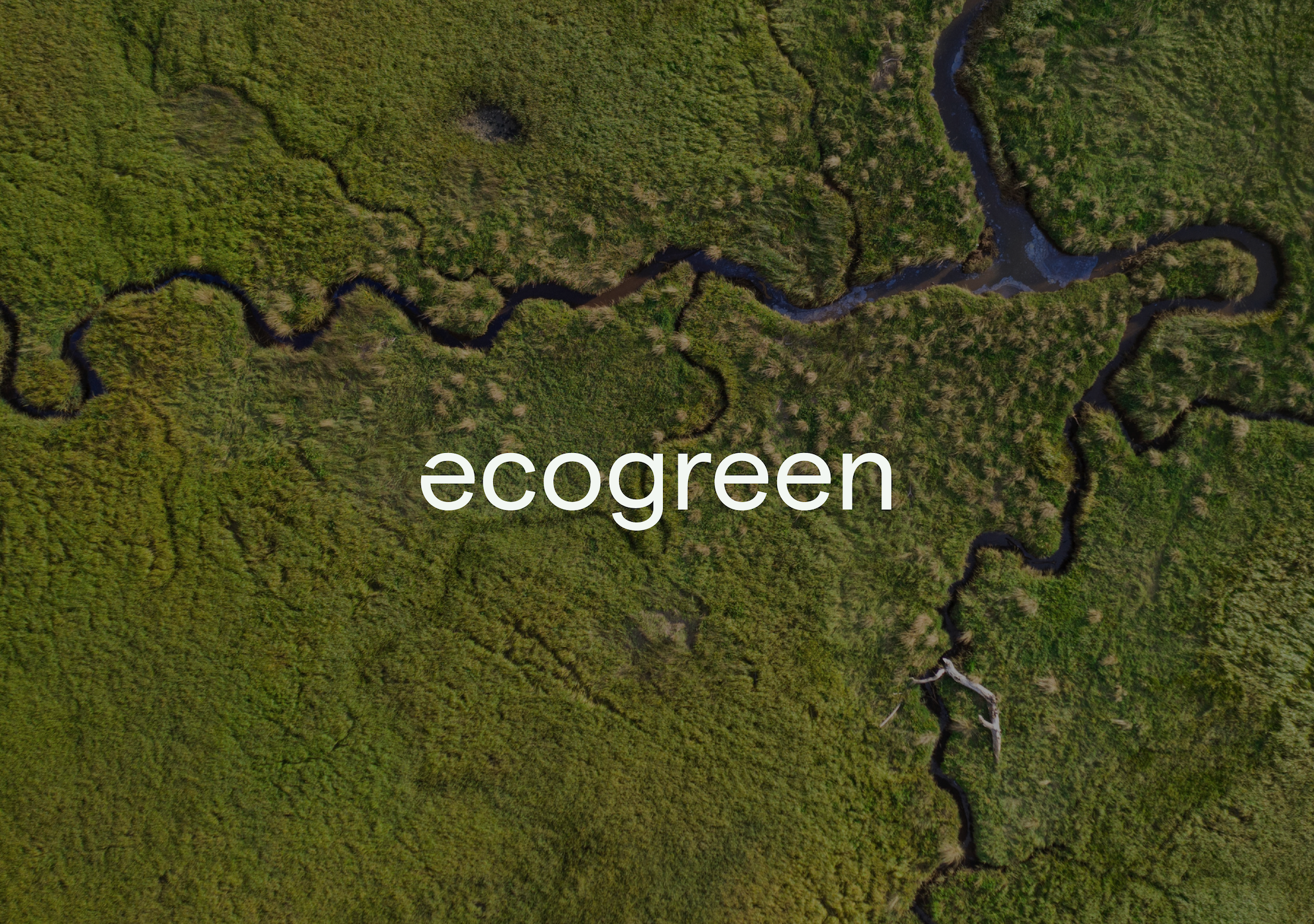
Ecogreen came to us needing a rebrand to reflect their expertise, product range and attract new clients and collaborations.
This wordmark is the first point of contact, to introduce Ecogreen. It has been designed to reflect the brand traits of openness, authenticity, honesty and optimism.
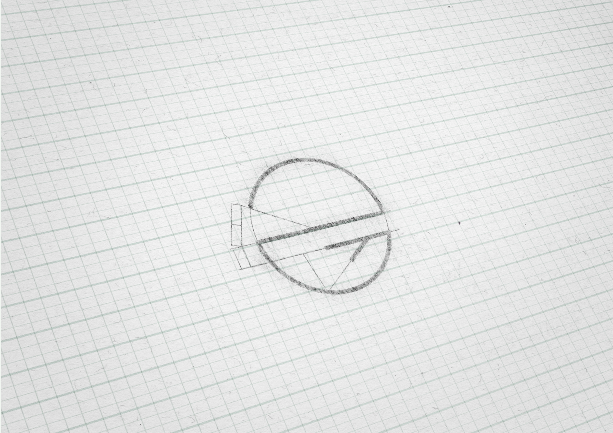
The brandmark introduces a common form seen in nature, the V or ‘chevron’, suggesting a leaf vein or a tree branch, both symbols of growth. The circularity suggests rengeneration and renewal.
BRAND STRATEGY
BRAND IDENTITY
PACKAGING
WEBSITE DESIGN